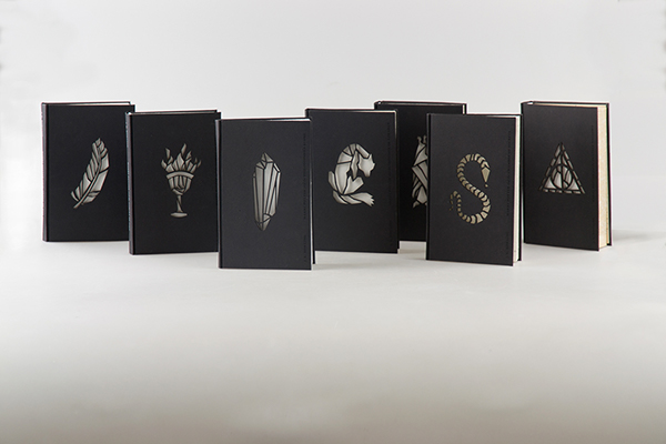
This Harry Potter series book cover redesign, by Hungarian designer Kincső Nagy, is a stunning take on the books, and a huge improvement over the original American illustrations (which, in the personal opinion of the blogger, were pretty painful to look at.)
Each cover is laser-cut with a symbol that represents the title or theme of that particular book. The look is minimal, solemn, almost grown-up--a reminder that even though Harry Potter is considered a children's series, it also deals with subjects of interest to anyone old enough to read.
The coolest part of these covers is that they actually glow in the dark.
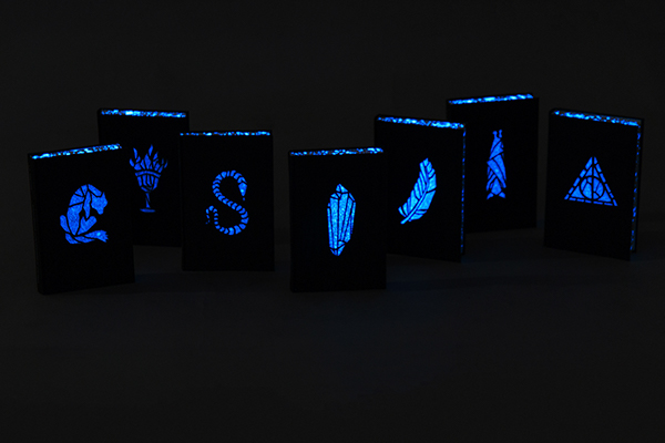
The designer comments that the effect is meant to reflect the "magic of the book." The books do indeed look like they have been made to glow by a wizard--success!
On a similar note, last year, the American Harry Potter editions got complete cover rehauls by artist Kazu Kibuishi, which, artistically, are a vast improvement over the originals. Design-wise, though, the placement and fonts of the titles looks awkward and amateurish, just slapped dead-center in the picture without any thought to the overall illustration. The way Mary Grand-Pre incorporated the title into her illustrations was genius. Perhaps she was a better designer, even if her illustrations were personally too misshapen and abstract.

The official American covers are both enchanting and flawed in their own ways. But if the publishers ever wanted to release a fantastic collector's edition, they would do well to hire Kinsco Nagy.
Sources:
https://www.behance.net/gallery/19617679/J-K-Rowling-Harry-Potter-
http://mashable.com/2013/07/31/harry-potter-new-book-covers/

No comments:
Post a Comment