Saturday, November 29, 2014

Shinzi Katoh - Designer of Pokemon Little Tales

How do you make Pokemon merchandise attractive to anyone over the age of ten?

Hire Shinzi Katoh!


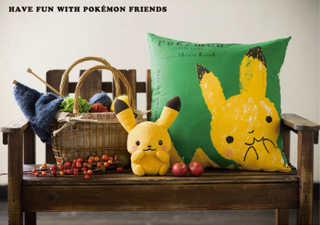
In 2013, Japan's Pokemon Center launched a new designer goods campaign called "Pokemon Little Tales." Apparently, the Pokemon Company realized that the first generation of children who grew up with Pokemon are now in their mid-twenties and thirties, perhaps parents of their own. They also realized that though Pokemon is intended for children, why not create merchandise for the parents of those children too? With that in mind, they sought to design goods for an adult audience.
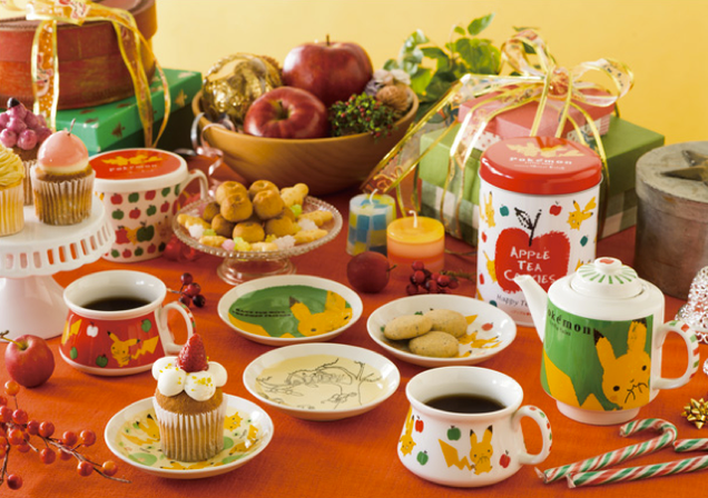

According to his profile, Shinzi Katoh has designed over 10,000 items for many high-profile companies over the span of his 30-year career, including shoes, clothing, picture books, jewelry and other goods. His popularity is based on the "gentle touch" and "fresh charm" he gives to existing characters when involved in collaborations with companies like Pokemon.


Katoh's designs for Pokemon drop the overly cartoonish and bright, contrasting colors characteristic of the series, opting to use earthier, more sophisticated, harmonious colors instead. They have the ageless-cute appeal of Sanrio's Hello Kitty, but with a more hand-made, homier, warmer feel. The items presented are mostly practical, too--like purses, handkerchiefs, umbrellas, tea sets, and stationery. No games or cards here.


Is it effective? The campaign is still going strong in 2014.

The target audience for Pokemon Little Tales is decidedly female, but the Pokemon Company also had a line of Charizard paraphernalia marketed to men--and it's super savvy.


There's a mug, a phone case, ties, cuff links, and wallets--everything the successful gamer needs to do business. If nobody says anything, everyone can just pretend those are dragon emblems from Wales. And that's the name of the game--incognito gamer goods for adults.

Sources:
http://kotaku.com/perhaps-the-cutest-pokemon-goods-ive-ever-seen-1473497216
http://www.pokemon.co.jp/info/2013/10/131011_p02.html
http://www.pokemon.co.jp/info/2013/03/130315_gd01.html

Tuesday, November 25, 2014

Pepsi Logo Redesign... BS?

Is BS too strong a word to describe the 2008 Pepsi logo redesign?


Anyone even remotely familiar with Adobe Illustrator knows that it only takes an hour to move around a couple of anchor points to get this kind of logo "redesign." Please.

Could this have been another "thirty years in five seconds" Paula-Scherr-Citigroup-like concept? Perhaps. But somehow, it feels like a million dollars was a little too much to spend on arbitrarily shifting around some vectors.

To be fair, this design does have some perks. It is cleaner and flatter in keeping with the current "flat" design trends. The colors have also been slightly tweaked, perhaps, to appear more modern in slightly lighter hues. It's more dynamic than the original, which was admittedly boring and starting to show its age. But what is with that white squiggly shape? It bugs. Reportedly, it's supposed to be a "smile," but it doesn't remotely resemble one, until someone tells you what it's supposed to be. Isn't that the antithesis of a good design?

Worst of all, there's a 27 page document detailing how this new Pepsi logo is supposedly the pinnacle of all design, probably created to convince the executives of Pepsi that this revamp was worth $1 million. Yeah, it's a little more 3-dimensional, but it's not the pinnacle of design.

Let's pretend Pepsi was funding some creative writing pursuit instead, if it makes anyone feel better.


Sources
http://gawker.com/5150582/breathtaking-document-reveals-pepsis-logo-is-pinnacle-of-entire-universe
http://adage.com/article/agency-news/breathtaking-word-purported-arnell-pepsi-doc/134552/

Saturday, November 22, 2014

Flaunt that fruit!


Fruit is naturally gorgeous, so designers can find endless inspiration in the appearance of fruit itself to package any fruit-based product. South African designer Marcel Buerkle keeps this in mind, using the beauty of fruit to showcase the lid of each respective product--fruit flavored jelly, in this case.

Detail is what makes for a successful design, and in this case, no detail has been left out. The logo "Quick" uses a spoon for the tail of the "Q", creating an instant visual that instructs the consumer how to use the product--eat it with a spoon! The fine print runs around the rim of the circular lid, an attractive and effective use of space. The colors are bright, the design simple, and everything goes toward effectively communicating the product.

Surprisingly, this is not a real product, just a digital rendering--props to the designer for rendering such a realistic package.

Source
https://www.behance.net/gallery/216596/Quick-Fruit-packaging-concept

Friday, November 21, 2014

Pearlfisher: Help!


Anyone who has ever been to an airport or a convenience store has probably seen Pearlfisher's "Help" packaging series. Composed of common remedies to everyday problems, it cuts through the competition with a simple, straightforward and clever marketing strategy.


This packaging campaign is particularly effective because it masks everyday medicinal aids like ibuprofen and band-aids as something novel, while pointing out the "obviousness" of the consumer's choice to use the product. It also appeals to the consumer's anticipated desperation with a sympathetic solution. Making the product appear indispensable, even inevitable, is perhaps one of the most successful marketing approaches in existence.

Source
http://www.pearlfisher.com/designs/help_packaging/

Monday, November 17, 2014

Thirsty Font


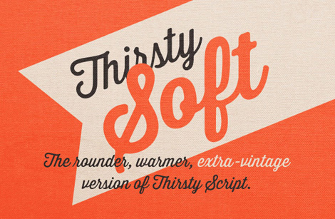
Thirsty Font by Yellow Design Studio is absolutely everywhere, and it's not even a major font-foundry typeface. It's the trendy font of the year. And a lot of the big dogs--Marie Callendar's, McDonald's, Hometown Buffet and Denny's, to name a few--seemingly have jumped on the Thirsty bandwagon and incorporated it into their menus and advertising, one way or another. (No joke--a casual flip through this month's coupon section of the newspaper reveals at least 6 instances of Thirsty in use.)


Marie Callendar's, McDonald's, ModCloth, Buco di Beppo, Denny's, World Cost Market, and HomeTown Buffet all use Thirsty in their promotional materials

This is great news for an independent design studio, of course, but it's great for consumers, too, because this is a very attractive font. Flowing, elegant, but still legible due to its tall x-height, it adds a friendly-yet-vintage flair to pretty much anything. Each letter relates to the next in a very comfortable way, so it's easy on the eyes. It's marketed mostly towards food and drink, but as the coupons section show, it's flexible enough to use anywhere. Congrats, Yellow Design Studio!

Source
http://www.yellowdesignstudio.com/

Thursday, November 13, 2014

Chipotle

Chipotle. CHIPOTLE.


Say what you will about their food, their design is one-of-a-kind.

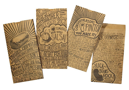
Its primary feature (and genius) is the chaotic, hand-written messages that pattern their napkins and cups of their burrito joints. Reading the messages is far more of a rewarding experience than even eating their food, sometimes.


It's a literal love letter to a Chipotle burrito. Why not, right?

Whether the messages of "no hormones!" or "INTEGRITY" are real don't even matter. The marketing is unique, hip, funny, often weird, but super-relatable. It creates the impression that Chipotle is having an earnest conversation with the customer, that Chiptole really gets what their clientele need and want. They want to eat at a place where it is okay to write love letters to their burritos. Definitely memorable.

Source
http://assets1.sequence.com/#/ourwork/chipotle

Friday, November 7, 2014

Dirty Apron Foods: Spice Labels


Even though Dirty Apron Foods label redesign might seem a bit boring at first glance, its minimal and modern appearance is actually quite effective.

If in fact the hexagonal shape in the lower left-hand corner is the logo of the company, then it's a brilliant use of a logo; not only to add interest to the logo, but also to showcase the beautiful colors of the spices within. It almost gives the appearance of jars of paint, as opposed to spices -- conceptually linking the idea that cooking is an art. It's a simple concept that can be translated across multiple products, and that is a mark of good, clean design.

Source
http://www.thedieline.com/blog/2010/11/4/dirty-apron-foods.html

Tuesday, November 4, 2014

Tumblr Dashboard Redesign: Thumbs Down!


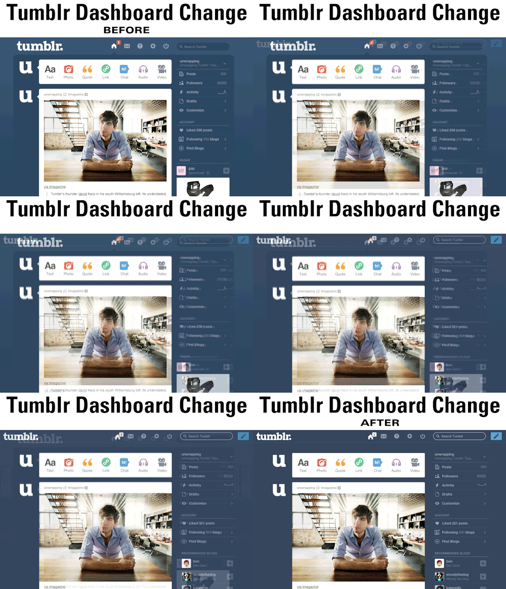
On October 30, Tumblr had a nasty surprise for its avid users: A "li'l" dashboard redesign. And it is not pretty.

What's wrong with it? Chief among its problems is the fact that images uploaded to Tumblr, originally modified to fit a space of 500px wide, now must expand to fit new parameters of 540 px. If a blog owner doesn't re-upload images for the new size, then the awful result is a dashboard full of pixelated images. Sure, it may seem nice to some to have bigger images, but the way the images cut off to the background is just awkward.

Secondly, the notification at the top of the screen used to be red--now they are white and blend in completely with the icons in the back. With a quick glance, a blogger wouldn't be able to tell whether or not they have a notification, which is totally not the point of notification. Bad design choice.

Lastly, the previous composition of the dashboard was more self-contained; now the navigation bar expands to fit the whole top of the screen. While that may be considered a better use of space, in practice it is awkward--now Tumblr looks like it's trying to escape from the screen. Maybe it's for good reason!

One GOOD change: The header is now a "sticky header," as it scrolls along with the viewer. And getting rid of the two-tone background is possibly an improvement, simplifying the viewer's experience. But it really doesn't outweigh the other criticisms.

Moral of the story, Tumblr, if it's not broke, don't fix it!

Sources

http://unwrapping.tumblr.com/post/101537464927/tumblr-dashboard-change-gif

http://staff.tumblr.com/post/101343889090/two-lil-changes-to-the-dashboard-rolling-out