At last! All 70 limes are done!
Here are my Top 8:
Enjoy!
Sarah and a Lime
Monday, December 8, 2014
Saturday, December 6, 2014
Packaging of the Future
In the spirit of our final project, this blog will turn its attention to sustainable packaging and waste reduction. Swedish design studio Tomorrow Machine has come up with an incredible series of biodegradable food packaging, titled "This Too Shall Pass." Made from organic materials like beeswax, sugar, and agar agar, the packaging is so environmentally-friendly that it is designed to only last about as long as the ingredients it contains. Three versions of the package were designed: one for dry ingredients (such as rice), oils, and liquids (pictured here, a smoothie). The exterior can either be peeled (rice), broken (oil), or pierced (smoothie).
The packaging takes a big cue from nature, particularly fruit. Consider bananas, pineapples, or kiwi. Presumably, these packages would be handled just like fruit. One would consume the interior and discard the organic exterior. Transport and mass-production might be difficult to work out at first, but it's probably worth all the trouble if it can eliminate the buildup of waste that doesn't decompose.
It's very exciting to think that something like this could change the future of packaging, and alleviate the worldwide problem of garbage and landfills.
Source
http://beautifuldecay.com/2014/08/01/cleverly-designed-sustainable-interactive-food-packaging-tomorrow-machine/
http://tomorrowmachine.se/
Monday, December 1, 2014
Harry Potter Book Covers
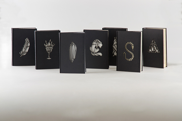
This Harry Potter series book cover redesign, by Hungarian designer Kincső Nagy, is a stunning take on the books, and a huge improvement over the original American illustrations (which, in the personal opinion of the blogger, were pretty painful to look at.)
Each cover is laser-cut with a symbol that represents the title or theme of that particular book. The look is minimal, solemn, almost grown-up--a reminder that even though Harry Potter is considered a children's series, it also deals with subjects of interest to anyone old enough to read.
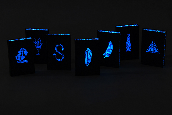
The coolest part of these covers is that they actually glow in the dark.
The designer comments that the effect is meant to reflect the "magic of the book." The books do indeed look like they have been made to glow by a wizard--success!
On a similar note, last year, the American Harry Potter editions got complete cover rehauls by artist Kazu Kibuishi, which, artistically, are a vast improvement over the originals. Design-wise, though, the placement and fonts of the titles looks awkward and amateurish, just slapped dead-center in the picture without any thought to the overall illustration. The way Mary Grand-Pre incorporated the title into her illustrations was genius. Perhaps she was a better designer, even if her illustrations were personally too misshapen and abstract.
The official American covers are both enchanting and flawed in their own ways. But if the publishers ever wanted to release a fantastic collector's edition, they would do well to hire Kinsco Nagy.
Sources:
https://www.behance.net/gallery/19617679/J-K-Rowling-Harry-Potter-
http://mashable.com/2013/07/31/harry-potter-new-book-covers/
Saturday, November 29, 2014
Shinzi Katoh - Designer of Pokemon Little Tales
How do you make Pokemon merchandise attractive to anyone over the age of ten?
Hire Shinzi Katoh!
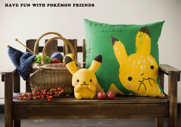
In 2013, Japan's Pokemon Center launched a new designer goods campaign called "Pokemon Little Tales." Apparently, the Pokemon Company realized that the first generation of children who grew up with Pokemon are now in their mid-twenties and thirties, perhaps parents of their own. They also realized that though Pokemon is intended for children, why not create merchandise for the parents of those children too? With that in mind, they sought to design goods for an adult audience.
According to his profile, Shinzi Katoh has designed over 10,000 items for many high-profile companies over the span of his 30-year career, including shoes, clothing, picture books, jewelry and other goods. His popularity is based on the "gentle touch" and "fresh charm" he gives to existing characters when involved in collaborations with companies like Pokemon.
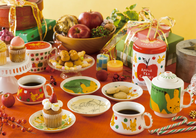
Katoh's designs for Pokemon drop the overly cartoonish and bright, contrasting colors characteristic of the series, opting to use earthier, more sophisticated, harmonious colors instead. They have the ageless-cute appeal of Sanrio's Hello Kitty, but with a more hand-made, homier, warmer feel. The items presented are mostly practical, too--like purses, handkerchiefs, umbrellas, tea sets, and stationery. No games or cards here.
Is it effective? The campaign is still going strong in 2014.
The target audience for Pokemon Little Tales is decidedly female, but the Pokemon Company also had a line of Charizard paraphernalia marketed to men--and it's super savvy.
There's a mug, a phone case, ties, cuff links, and wallets--everything the successful gamer needs to do business. If nobody says anything, everyone can just pretend those are dragon emblems from Wales. And that's the name of the game--incognito gamer goods for adults.
Sources:
http://kotaku.com/perhaps-the-cutest-pokemon-goods-ive-ever-seen-1473497216
http://www.pokemon.co.jp/info/2013/10/131011_p02.html
http://www.pokemon.co.jp/info/2013/03/130315_gd01.html
Hire Shinzi Katoh!
In 2013, Japan's Pokemon Center launched a new designer goods campaign called "Pokemon Little Tales." Apparently, the Pokemon Company realized that the first generation of children who grew up with Pokemon are now in their mid-twenties and thirties, perhaps parents of their own. They also realized that though Pokemon is intended for children, why not create merchandise for the parents of those children too? With that in mind, they sought to design goods for an adult audience.
According to his profile, Shinzi Katoh has designed over 10,000 items for many high-profile companies over the span of his 30-year career, including shoes, clothing, picture books, jewelry and other goods. His popularity is based on the "gentle touch" and "fresh charm" he gives to existing characters when involved in collaborations with companies like Pokemon.
Katoh's designs for Pokemon drop the overly cartoonish and bright, contrasting colors characteristic of the series, opting to use earthier, more sophisticated, harmonious colors instead. They have the ageless-cute appeal of Sanrio's Hello Kitty, but with a more hand-made, homier, warmer feel. The items presented are mostly practical, too--like purses, handkerchiefs, umbrellas, tea sets, and stationery. No games or cards here.
Is it effective? The campaign is still going strong in 2014.
The target audience for Pokemon Little Tales is decidedly female, but the Pokemon Company also had a line of Charizard paraphernalia marketed to men--and it's super savvy.
There's a mug, a phone case, ties, cuff links, and wallets--everything the successful gamer needs to do business. If nobody says anything, everyone can just pretend those are dragon emblems from Wales. And that's the name of the game--incognito gamer goods for adults.
Sources:
http://kotaku.com/perhaps-the-cutest-pokemon-goods-ive-ever-seen-1473497216
http://www.pokemon.co.jp/info/2013/10/131011_p02.html
http://www.pokemon.co.jp/info/2013/03/130315_gd01.html
Tuesday, November 25, 2014
Pepsi Logo Redesign... BS?
Is BS too strong a word to describe the 2008 Pepsi logo redesign?
Anyone even remotely familiar with Adobe Illustrator knows that it only takes an hour to move around a couple of anchor points to get this kind of logo "redesign." Please.
Could this have been another "thirty years in five seconds" Paula-Scherr-Citigroup-like concept? Perhaps. But somehow, it feels like a million dollars was a little too much to spend on arbitrarily shifting around some vectors.
To be fair, this design does have some perks. It is cleaner and flatter in keeping with the current "flat" design trends. The colors have also been slightly tweaked, perhaps, to appear more modern in slightly lighter hues. It's more dynamic than the original, which was admittedly boring and starting to show its age. But what is with that white squiggly shape? It bugs. Reportedly, it's supposed to be a "smile," but it doesn't remotely resemble one, until someone tells you what it's supposed to be. Isn't that the antithesis of a good design?
Worst of all, there's a 27 page document detailing how this new Pepsi logo is supposedly the pinnacle of all design, probably created to convince the executives of Pepsi that this revamp was worth $1 million. Yeah, it's a little more 3-dimensional, but it's not the pinnacle of design.
Let's pretend Pepsi was funding some creative writing pursuit instead, if it makes anyone feel better.
Sources
http://gawker.com/5150582/breathtaking-document-reveals-pepsis-logo-is-pinnacle-of-entire-universe
http://adage.com/article/agency-news/breathtaking-word-purported-arnell-pepsi-doc/134552/
Anyone even remotely familiar with Adobe Illustrator knows that it only takes an hour to move around a couple of anchor points to get this kind of logo "redesign." Please.
Could this have been another "thirty years in five seconds" Paula-Scherr-Citigroup-like concept? Perhaps. But somehow, it feels like a million dollars was a little too much to spend on arbitrarily shifting around some vectors.
To be fair, this design does have some perks. It is cleaner and flatter in keeping with the current "flat" design trends. The colors have also been slightly tweaked, perhaps, to appear more modern in slightly lighter hues. It's more dynamic than the original, which was admittedly boring and starting to show its age. But what is with that white squiggly shape? It bugs. Reportedly, it's supposed to be a "smile," but it doesn't remotely resemble one, until someone tells you what it's supposed to be. Isn't that the antithesis of a good design?
Worst of all, there's a 27 page document detailing how this new Pepsi logo is supposedly the pinnacle of all design, probably created to convince the executives of Pepsi that this revamp was worth $1 million. Yeah, it's a little more 3-dimensional, but it's not the pinnacle of design.
Let's pretend Pepsi was funding some creative writing pursuit instead, if it makes anyone feel better.
Sources
http://gawker.com/5150582/breathtaking-document-reveals-pepsis-logo-is-pinnacle-of-entire-universe
http://adage.com/article/agency-news/breathtaking-word-purported-arnell-pepsi-doc/134552/
Saturday, November 22, 2014
Flaunt that fruit!
Fruit is naturally gorgeous, so designers can find endless inspiration in the appearance of fruit itself to package any fruit-based product. South African designer Marcel Buerkle keeps this in mind, using the beauty of fruit to showcase the lid of each respective product--fruit flavored jelly, in this case.
Detail is what makes for a successful design, and in this case, no detail has been left out. The logo "Quick" uses a spoon for the tail of the "Q", creating an instant visual that instructs the consumer how to use the product--eat it with a spoon! The fine print runs around the rim of the circular lid, an attractive and effective use of space. The colors are bright, the design simple, and everything goes toward effectively communicating the product.
Surprisingly, this is not a real product, just a digital rendering--props to the designer for rendering such a realistic package.
Source
https://www.behance.net/gallery/216596/Quick-Fruit-packaging-concept
Friday, November 21, 2014
Pearlfisher: Help!
Anyone who has ever been to an airport or a convenience store has probably seen Pearlfisher's "Help" packaging series. Composed of common remedies to everyday problems, it cuts through the competition with a simple, straightforward and clever marketing strategy.
This packaging campaign is particularly effective because it masks everyday medicinal aids like ibuprofen and band-aids as something novel, while pointing out the "obviousness" of the consumer's choice to use the product. It also appeals to the consumer's anticipated desperation with a sympathetic solution. Making the product appear indispensable, even inevitable, is perhaps one of the most successful marketing approaches in existence.
Source
http://www.pearlfisher.com/designs/help_packaging/
Subscribe to:
Posts (Atom)