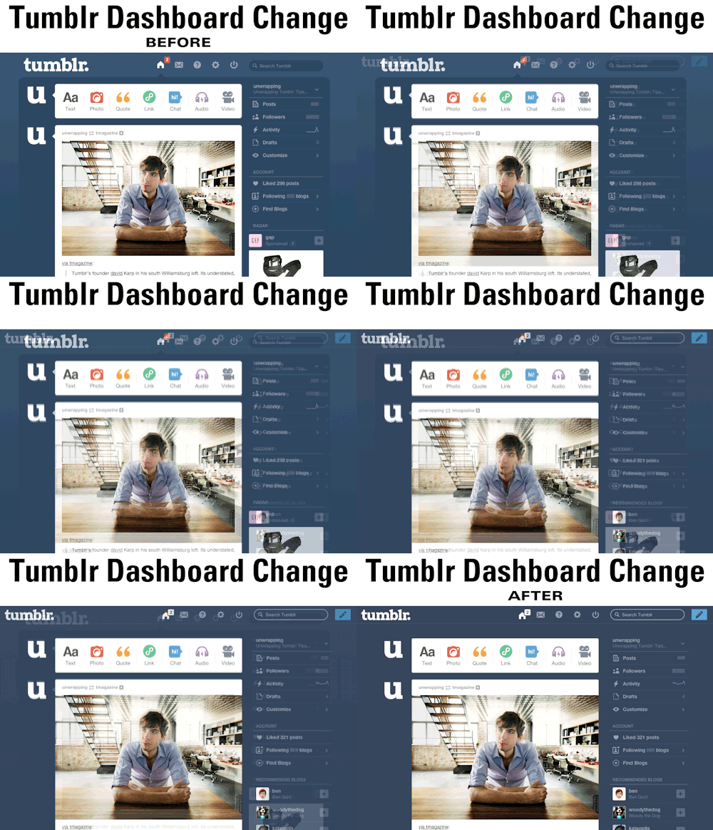
On October 30, Tumblr had a nasty surprise for its avid users: A "li'l" dashboard redesign. And it is not pretty.
What's wrong with it? Chief among its problems is the fact that images uploaded to Tumblr, originally modified to fit a space of 500px wide, now must expand to fit new parameters of 540 px. If a blog owner doesn't re-upload images for the new size, then the awful result is a dashboard full of pixelated images. Sure, it may seem nice to some to have bigger images, but the way the images cut off to the background is just awkward.
Secondly, the notification at the top of the screen used to be red--now they are white and blend in completely with the icons in the back. With a quick glance, a blogger wouldn't be able to tell whether or not they have a notification, which is totally not the point of notification. Bad design choice.
Lastly, the previous composition of the dashboard was more self-contained; now the navigation bar expands to fit the whole top of the screen. While that may be considered a better use of space, in practice it is awkward--now Tumblr looks like it's trying to escape from the screen. Maybe it's for good reason!
One GOOD change: The header is now a "sticky header," as it scrolls along with the viewer. And getting rid of the two-tone background is possibly an improvement, simplifying the viewer's experience. But it really doesn't outweigh the other criticisms.
Moral of the story, Tumblr, if it's not broke, don't fix it!
Sources
http://unwrapping.tumblr.com/post/101537464927/tumblr-dashboard-change-gif
http://staff.tumblr.com/post/101343889090/two-lil-changes-to-the-dashboard-rolling-out

No comments:
Post a Comment